網頁教學|WordPress如何做出符合RWD的區塊版面
Table of Contents

RWD響應式網頁設計,是讓使用者在用手機瀏覽您的網站時,不用一直忙著縮小放大拖曳,給使用者最佳瀏覽畫面。
本影片適合對象:剛接觸WordPress不孰悉古騰堡功能的人
影片介紹
●RWD實作教學
Step one.建立【三欄式】欄位
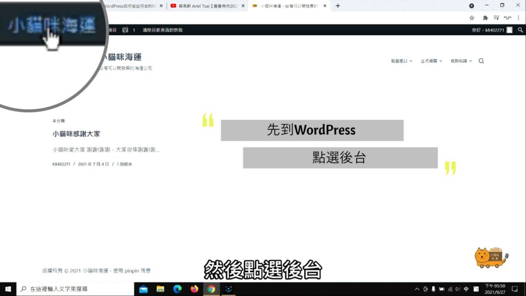
◆首先,先進網頁【後台】,選擇要更改的文章
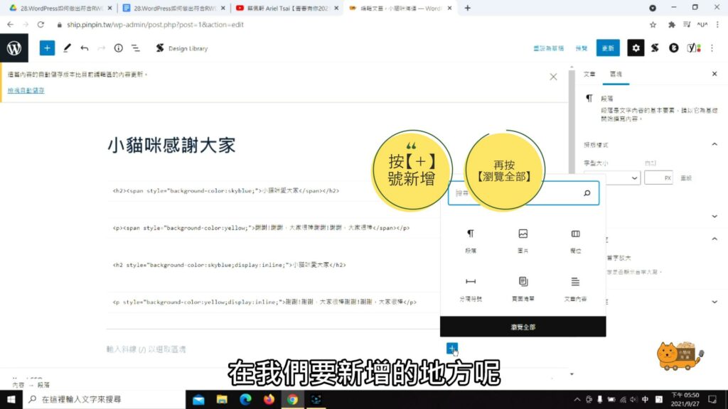
◆ 在文章的頁面,滑鼠移至要新增的地方按【+】的符號
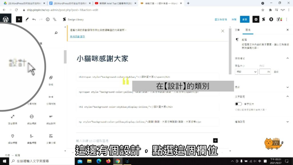
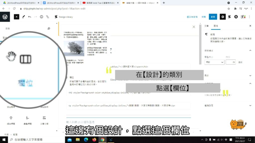
◆ 在【設計】的類別
◆ 點選【欄位】
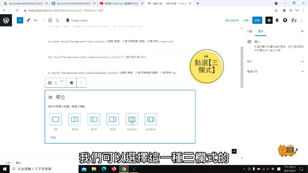
◆ 再點選【三欄式】的欄位
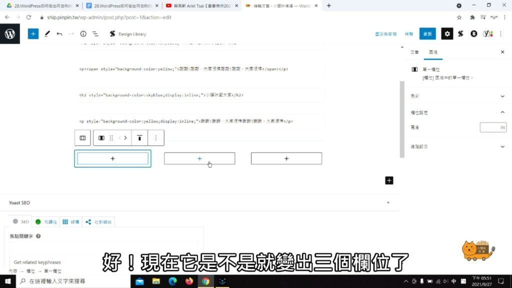
◆ 註:如下圖,這時的欄位預設自動就是【RWD】
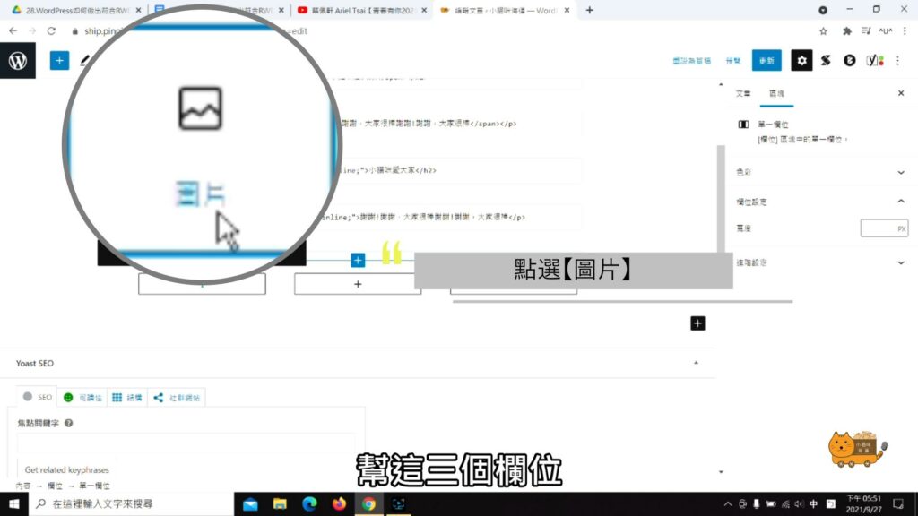
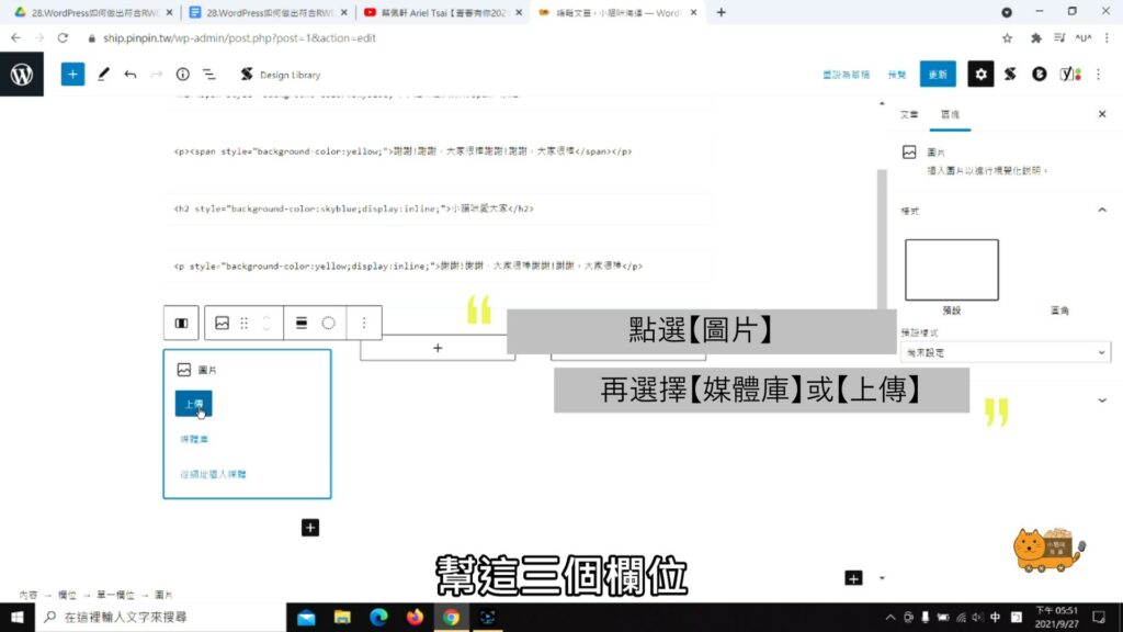
◆新增圖片: 在三個欄位點【圖片】
◆ 點擊【媒體庫】或【上傳】新增圖片
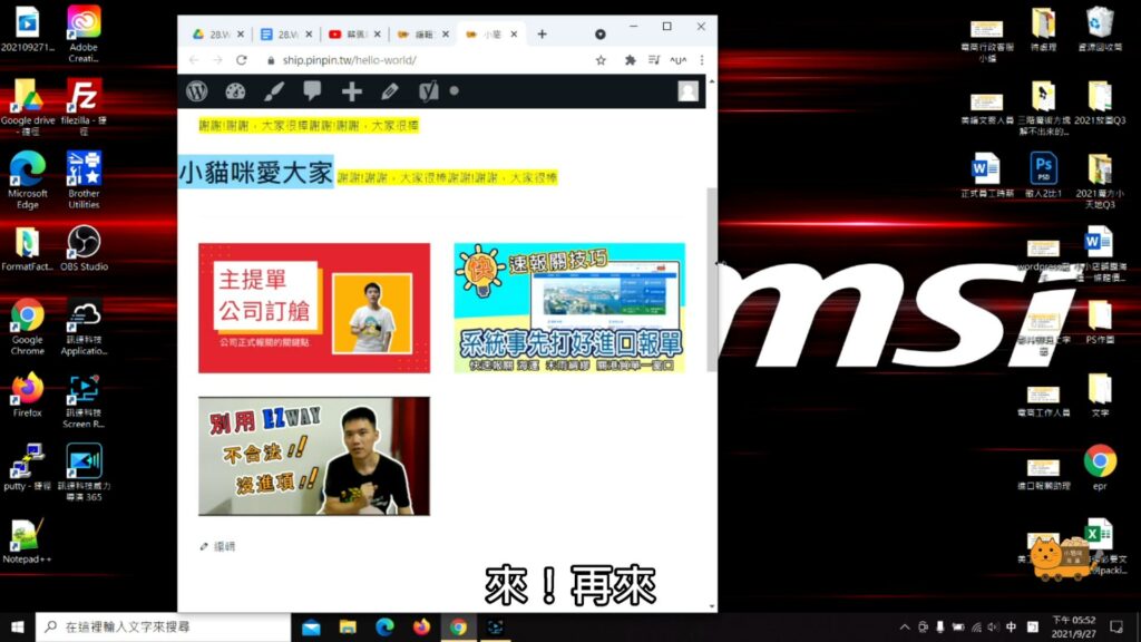
◆ 新增完圖片,我們可以到網頁的【前端】做小測試
當圖片縮小時(如下圖)
◆ 當圖片再放大時(如下圖)
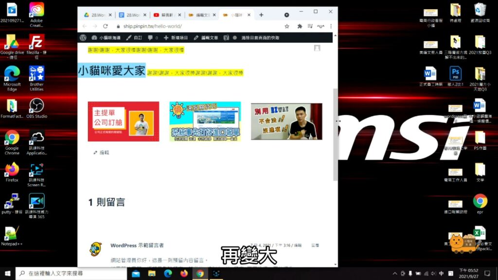
◆ 可以發現圖文會依照網頁尺寸的大小改變
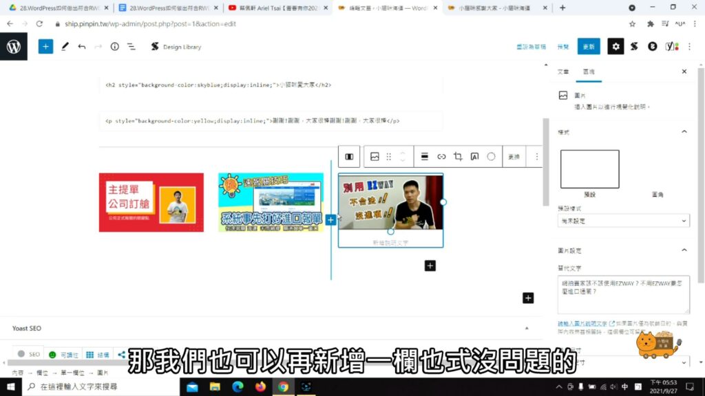
Step two.新增/移除欄位
◆ 新增欄位:可再圖與圖中間,點選【+】的符號新增欄位
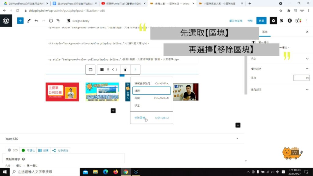
◆ 移除欄位:點選【圖片的區塊】
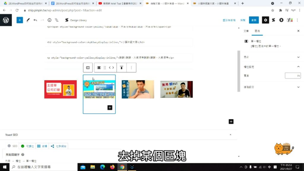
◆ 再點【⁝】的符號,最後再點選【移除區塊】